Sumo Digital


The reason that I decided to edit this photo is because I represented "Creative and Digital Sheffield" in blue and red (Digital being blue and Creative being red) so because the original logo was red (Representing Creative) I decided to change it blue to make it relevant to "Digital" as it has digital in the name anyway. I did this using a standard blue fill tool.
Sheffield Park Hill Flats

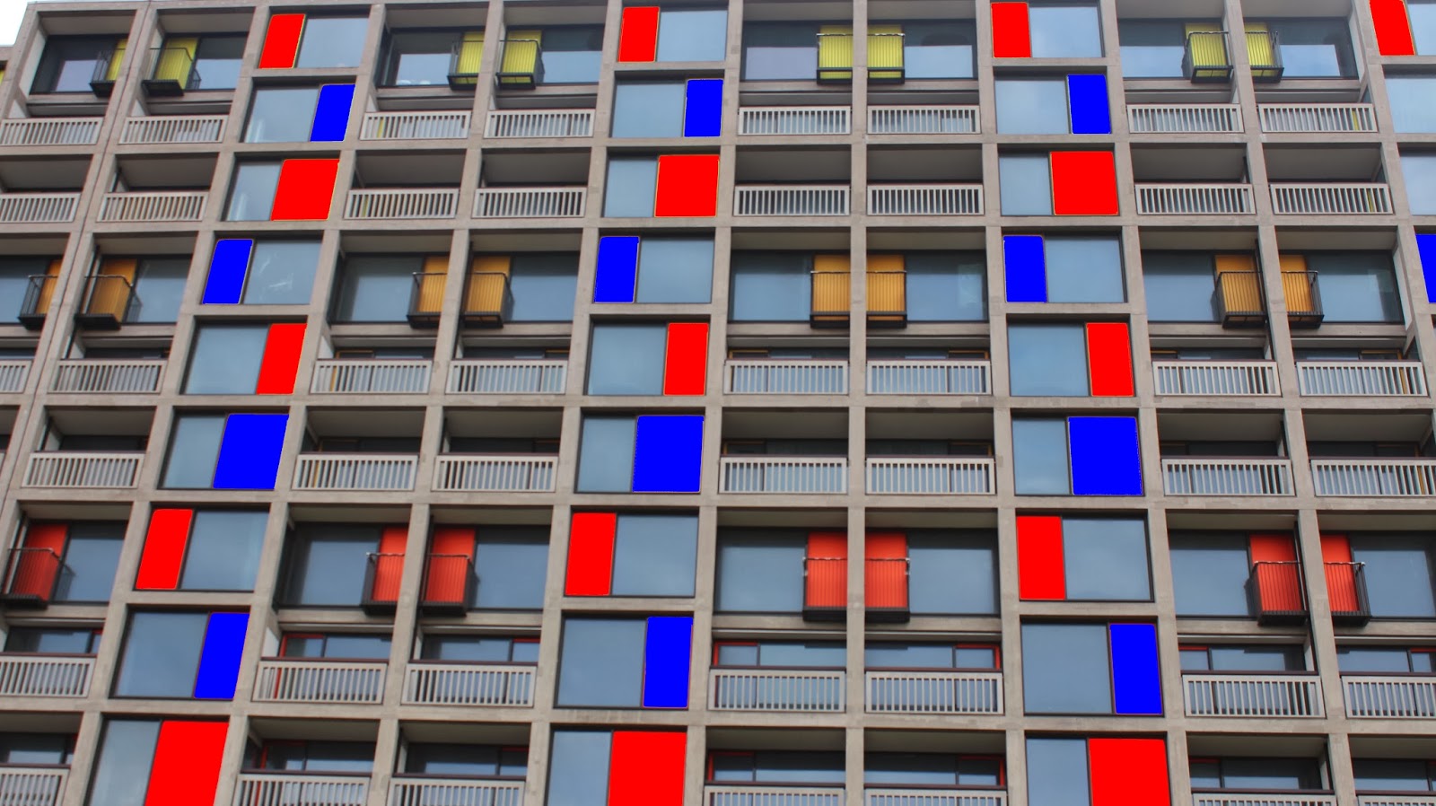
The reason i decided to do what i did to the picture is because the image i had taken had all ready being used in a colourful way because of the multicoloured panels so to relate this to my work i decided to change some panels blue (To relate ti Digital) and to change some red (To relate to Creative). I managed to do this using a standard red and blue colour fill tool.
Sheffield Star Gazer


In this picture I wanted the Star Gazer to be the dominant attraction to look at and because the trees in the background have such a striking light brown tint to them I decided to make the main patten on the star gazer white by using a rubber tool and I also changed the whole image to a darker colour to represent night but to also make the white stand out more.
The House


In this image i wanted to show that the picture i had taken was in sheffield as the place and the thing which the building is used for isn't that well known amongst people. To do this i cut away the not very attractive looking scaffold in the back ground using the magic wand effect and a rubber and i also added in some clouds and a sky which were taken from another one of my images. In the end people will be able to recognise that the picture taken is in sheffield as of the view in the back ground but also will be able to appreciate the art work and graffiti.
Sheffield City View


The reason i decided to do what i did is because i realised that the image that i had take had a lot of "Creative and Digital" buildings and companies in it so to relate this to my work i added in the blue and red from my other work projects just to keep the continuity in my work. And i did this using the magic wand effect and the fill tool and a standard blue and red colour.
No comments:
Post a Comment