Monday, 14 October 2013
Sunday, 13 October 2013
LO4 Evidence Of Editing with Text
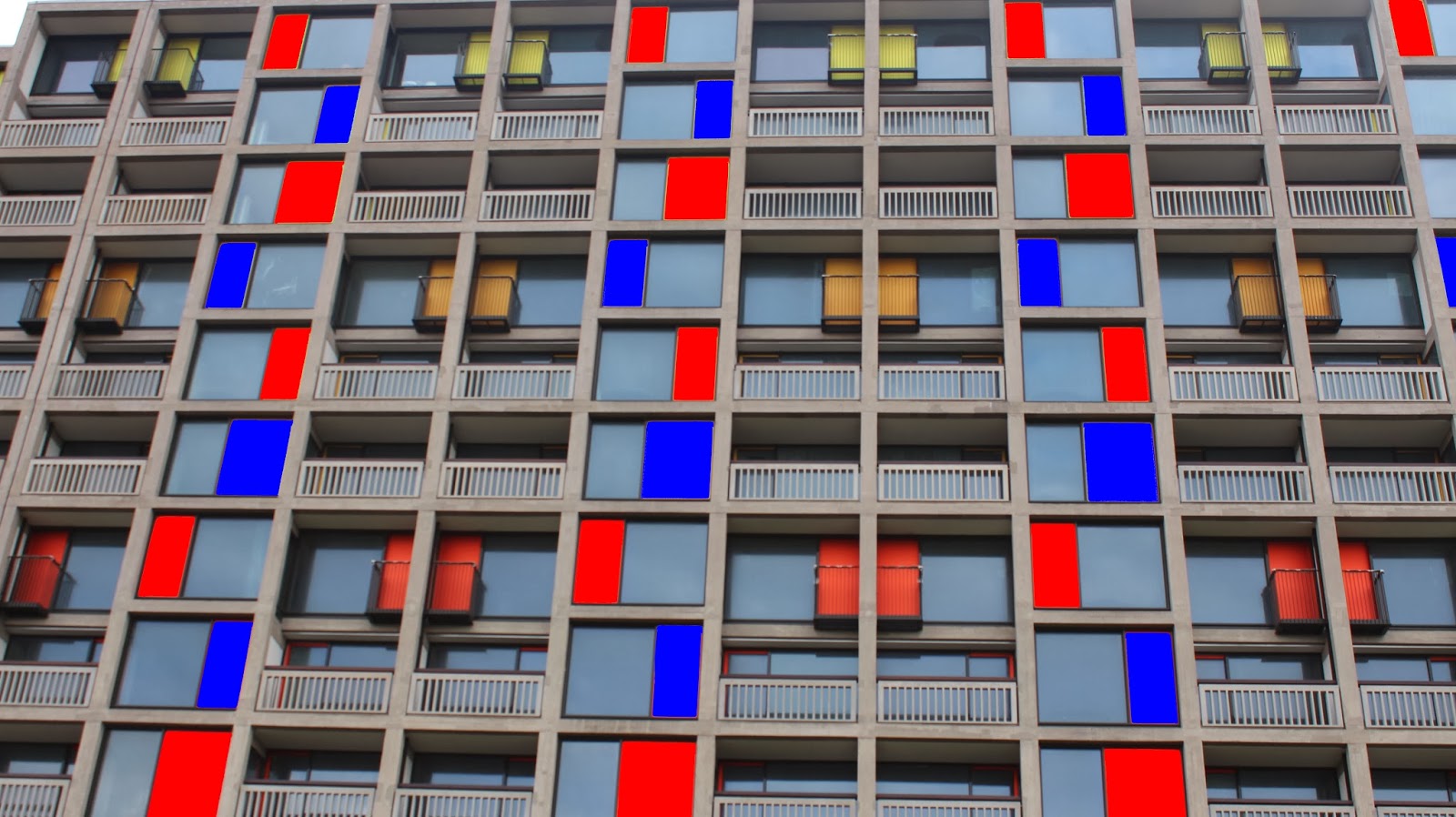
this is just proof that some of my final 10 photos were edited to fit the criteria "Creative and digital sheffield" with the edited versions being on the bottom and the originals being on the top
Sumo Digital
The reason that I decided to edit this photo is because I represented "Creative and Digital Sheffield" in blue and red (Digital being blue and Creative being red) so because the original logo was red (Representing Creative) I decided to change it blue to make it relevant to "Digital" as it has digital in the name anyway. I did this using a standard blue fill tool.
Sheffield Park Hill Flats
The reason i decided to do what i did to the picture is because the image i had taken had all ready being used in a colourful way because of the multicoloured panels so to relate this to my work i decided to change some panels blue (To relate ti Digital) and to change some red (To relate to Creative). I managed to do this using a standard red and blue colour fill tool.
Sheffield Star Gazer
In this picture I wanted the Star Gazer to be the dominant attraction to look at and because the trees in the background have such a striking light brown tint to them I decided to make the main patten on the star gazer white by using a rubber tool and I also changed the whole image to a darker colour to represent night but to also make the white stand out more.
The House
In this image i wanted to show that the picture i had taken was in sheffield as the place and the thing which the building is used for isn't that well known amongst people. To do this i cut away the not very attractive looking scaffold in the back ground using the magic wand effect and a rubber and i also added in some clouds and a sky which were taken from another one of my images. In the end people will be able to recognise that the picture taken is in sheffield as of the view in the back ground but also will be able to appreciate the art work and graffiti.
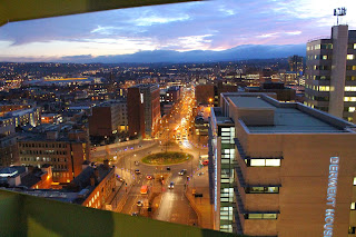
Sheffield City View
The reason i decided to do what i did is because i realised that the image that i had take had a lot of "Creative and Digital" buildings and companies in it so to relate this to my work i added in the blue and red from my other work projects just to keep the continuity in my work. And i did this using the magic wand effect and the fill tool and a standard blue and red colour.
LO4 Final 10 Photos and Edited
My 10 finished photos
Creative and Digital Sheffield
City View
City Lights
The House
The Electric Works
Park Hill Flats
The Steel Steps
Sumo Digital
City Centre
Sheffield Star Gazer
Saturday, 12 October 2013
LO3 Evidence Of Storage
this is the folder where i stored my raw images
and this is the folder where i saved my final 10 photographs and my final 10 finished and edited photographs (final outcomes)
and this is the folder where i saved my final 10 photographs and my final 10 finished and edited photographs (final outcomes)
Friday, 11 October 2013
LO3: Understanding camera settings
ISO
The camera’s ISO setting is its sensitivity to light. The higher the ISO, the more sensitive it is. This is measured according to international standards, so ISO100 on one camera will be exactly the same as ISO100 on another.
Each ISO setting is double the one before: if you increase the ISO from 100 to 200, you double the camera’s sensitivity; and if you increase it from 200 to 400, you double it again. This carries on through the ISO scale.
This is deliberate. The ISO settings are designed to double (or halve) the exposure in the same way that the lens aperture settings and shutter speed settings are, and this is why the lens aperture, shutter speed and ISO are often described as the ‘exposure triangle’.
For example, if you want to use a faster shutter speed without changing the aperture, you could increase the ISO instead.
This relationship between lens aperture, shutter speed and ISO could quickly get complicated, but there are drawbacks to changing the ISO which mean that in practice you tend to change the ISO only when you have to.
Simply put, aperture is a hole within a lens, through which light travels into the camera body. It is easier to understand the concept if you just think about our eyes. Every camera that we know of today is designed like human eyes. The cornea in our eyes is like the front element of a lens – it gathers all external light, then bends it and passes it to the iris. Depending on the amount of light, the iris can either expand or shrink, controlling the size of the pupil, which is a hole that lets the light pass further into the eye. The pupil is essentially what we refer to as aperture in photography. The amount of light that enters the retina (which works just like the camera sensor), is limited to the size of the pupil – the larger the pupil, the more light enters the retina. So, the easiest way to remember aperture, is by associating it with your pupil. Large pupil size equals large aperture, while small pupil size equals small aperture.

Shutter Speed
Shutter speed, also known as “exposure time”, stands for the length of time a camera shutter is open to expose light into the camera sensor. If the shutter speed is fast, it can help to freeze action completely, as seen in the above photo of the dolphin. If the shutter speed is slow, it can create an effect called “motion blur”, where moving objects appear blurred along the direction of the motion. This effect is used quite a bit in advertisements of cars and motorbikes, where a sense of speed and motion is communicated to the viewer by intentionally blurring the moving wheels.
LO3 RAW Images/10-15 final images chosen
These are some images that I had taken and decided to put them into iPhoto to save my final 10-15 pictures.
Thursday, 10 October 2013
LO2 Reflections On Progress On Blog
15/04/14
Everything in LO1 have been finished
27/04/14
LO1 and LO2 have been complete and checked
05/05/14
At this point all my LO1, LO2 amd LO3 have been complete.
20/05/14
All my LO4 have been finished and i have checked my work to see if everything is done.
02/06/14
At this point i have finished all my work and I'm waiting for my photo story to be uploaded on to YouTube so i can add it to my work.
04/06/14
Everything has been checked, finished and done.
Wednesday, 9 October 2013
Tuesday, 8 October 2013
Monday, 7 October 2013
LO2 Call Sheet, Model Release Form, Permissions List
None of the documentation was needed as i didn't need permission to use the areas that i took my photos in and i didnt use anyone in my images.
Sunday, 6 October 2013
LO2 Finished shot plans
These are my shot plans that i quickly drew to relate to my photos that i had a idea about and based of these drawings they were quite accurate and successful.
Subscribe to:
Comments (Atom)


